My name is John Dermot Woods. I’m the author and illustrator of Always Blue, the first book in Radix Media’s Futures sci-fi chapbook series. Today I’m going to take you behind the scenes of creating the cover! It’s been a pleasure working on this project with the talented folks at Radix, because they are people who care about books, from the sentences themselves to the paper they’re printed on. Sarah, Nick, and Lantz know how to make objects that aren’t just beautiful, but engaging. I’m often drawn to illustrate my stories (even ones like Always Blue that weren’t meant to include images) because I want to engage my reader in an intimate way. There is something about a drawn image that feels vulnerable and volatile. And when that drawing is printed on a page that has a certain texture, and it’s wrapped in a letterpress printed cover where you can feel the ink biting into it, you become immersed in the object you’re holding. You’re left not only with the trace of the author, but also the people who physically made it.
I’m holding a printed copy of Always Blue for the first time as I write this. This story is a very different thing than the text file that’s existed in my rented piece of the digital cloud for so many months. The product of Radix’s labor is a testament to the fact that form is as necessary to the artistic experience as the content around which it’s built.
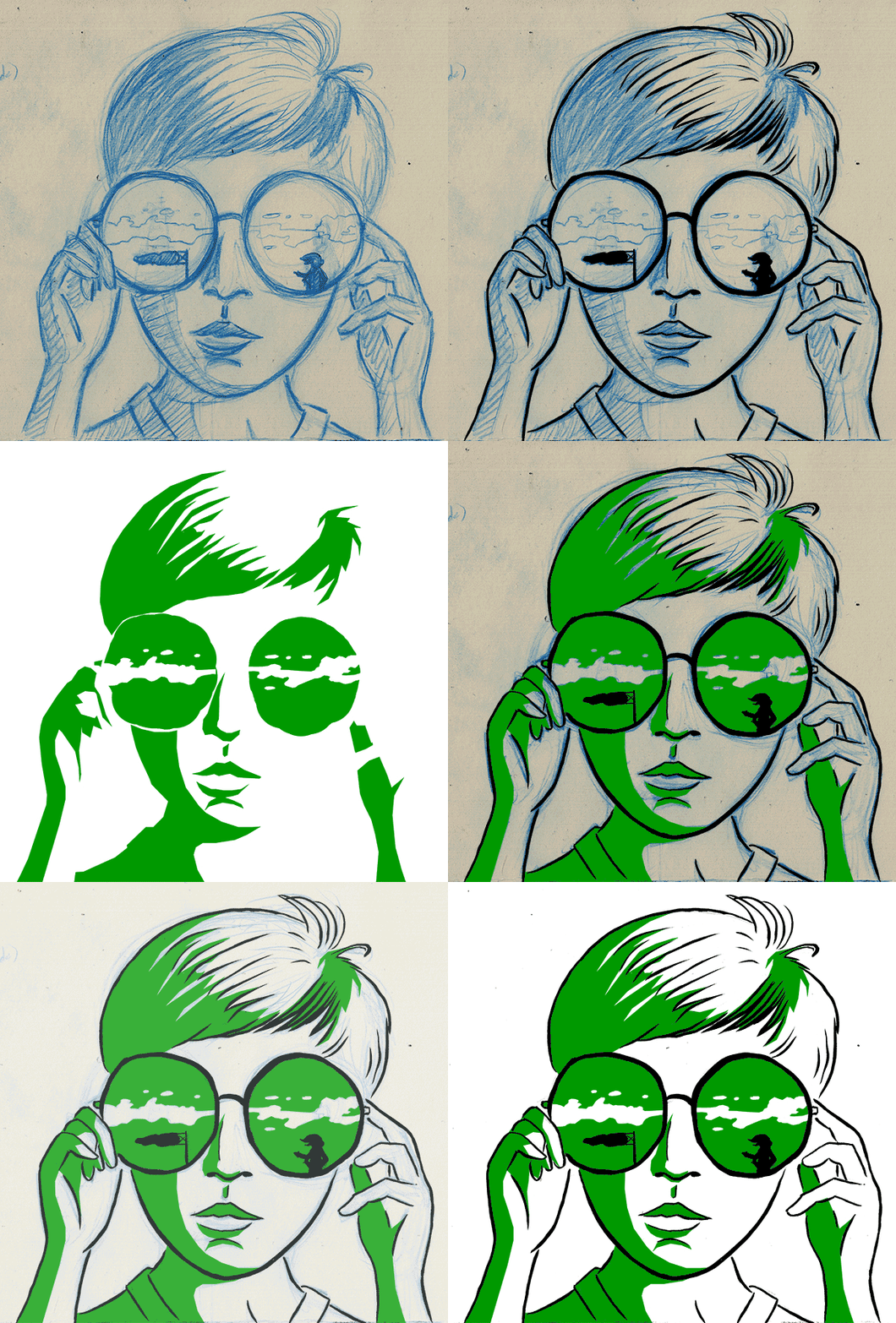
Lantz asked me to share some thoughts and images about my drawing process. I wondered who would want insight into my awkward style and labored process. But, here it is. For those of you out there who find drawing very difficult, know that you’re not alone! I’ll take you through my process for drawing the Always Blue cover image step-by-step. The cover image is a close-up of Midori’s sunglasses-clad face reflecting Schulz—and a windsock!
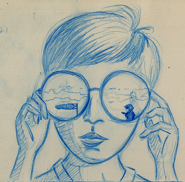
First, I draw the image with blue pencil on Bristol board. I use a Staedtler non-photo blue pencil to rough out the drawing. I know “non-photo” is meaningless in the digital age, but I like that it’s super light. Then I tighten up my pencils with a softer, darker Faber-Castell pthalo blue pencil. I buy both of these pencils by the dozen. (And I leave KUM Palomino sharpeners all around my house to keep my points fine. These sharpeners are the best and my kids always steal them.) I use whatever Bristol I have—usually Strathmore 300—because it’s all thick enough to hold my ink.
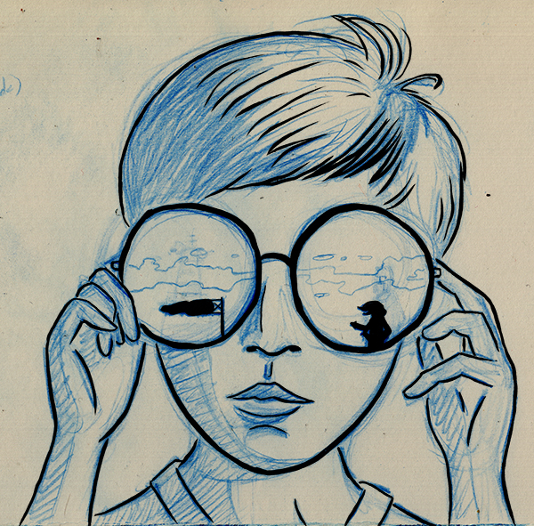 Next, I use a brush to ink my lines. I typically use a Windsor Series 7 and whatever ink I have—again, not choosy, I can get it all to scan the same—but when I was drawing this picture I was displaced from my home, so I used my trusty Pentel Pocket Brush. It has its own ink cartridge so I can use it anywhere without making a mess. The line is not quite as sharp as a fancy sable hair brush, but still, like everyone, I love the Pocket Brush. It just works.
 Then I scan in the inks as pure black and white (no grays). This gives you a bold line.
 In Photoshop, I use the polygonal lasso tool to click around all of the shadows that I drew in pencil and I color those, in this case, green. I tuck this layer beneath the black ink layer.
 This is what the shadow layer looks like on its own. (Sometimes this looks cooler than the whole drawing.)
 Finally, I drop out the original pencils, and the image is complete and ready to reproduce for printing.
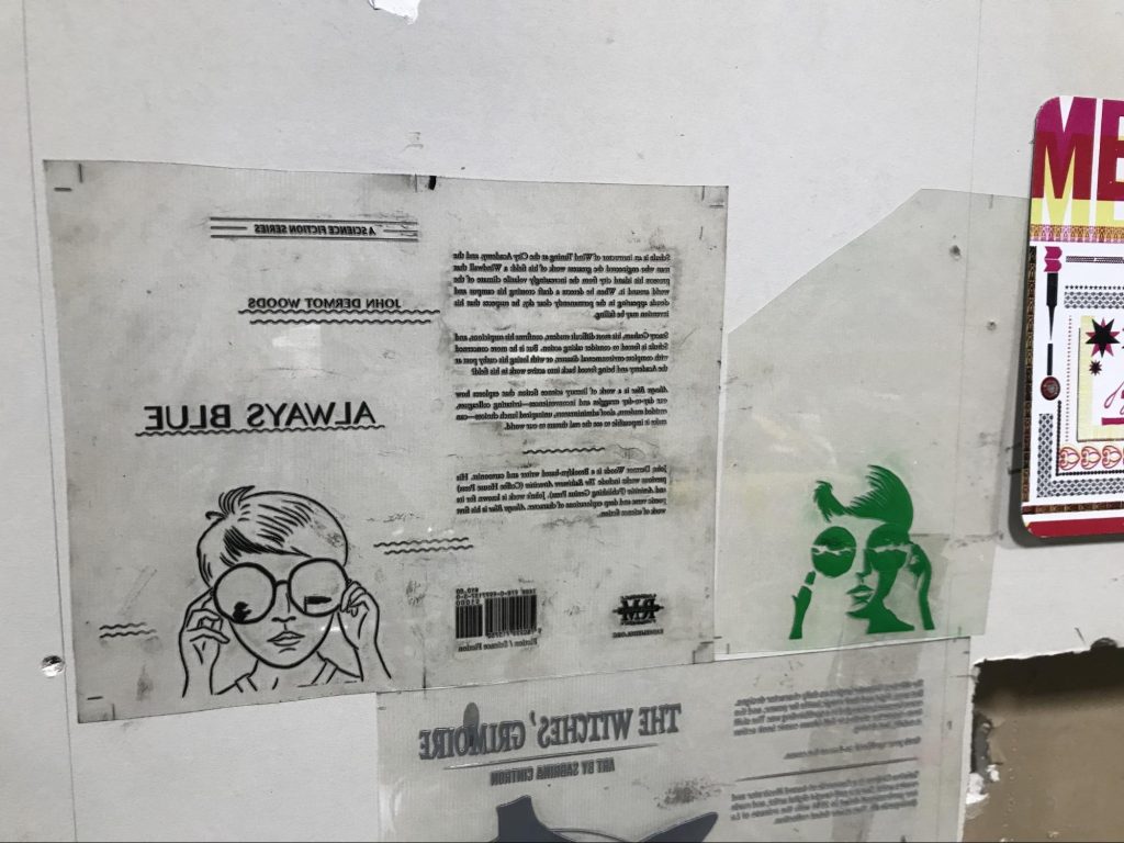
Nick printed this image on the cover using a Heidelberg Windmill letterpress. Unintentionally, my layering process lends itself well to this style of printing, as we already had a separate black and a separate green layer defined. Here are the plates that Nick used:
And, that’s it—in more detail than anyone asked for.
Thanks to the people at Radix Media for taking such care with my book and making such a substantial thing to hold.
Publisher’s Note: If you enjoyed this post, check out an excerpt of Always Blue on our blog. Visit our store to purchase the story on its own, or purchase the box set and get all seven stories in the series!
