
Introduction
ou’re at a critical networking event, and you see a colleague you’ve been wanting to collaborate with for quite some time. You work up the nerve to speak to them and have a wonderful conversation, and before parting, you reach into your pocket to pull out a business card. As the person looks at it, you see them squint; they look curiously at it for a while before offering you a smile and thanking you for the chat.
After they leave, you start thinking: was the type too small? Did the art make the layout feel crowded? Did it have a border with a super-thin margin that made everything feel off-centered? Was there any pixelation in the images? Was the paper thick enough? In the end, you never hear from them.
The cliché is true—you only get one chance to make a good first impression. The best thing you can do when networking is to have printed assets that are clean and professional. This is especially true if you’re a freelancer who is selling your personal brand in addition to your service. Below are 7 tips for successful print design that will help you slay those networking parties and get ahead of the competition!
1. Limit the color palette.
We see the world in full color. Some parts of it are beautiful, other parts of it are tacky. (Note: no judgment on your Christmas sweater, but…) The more colors there are to process, the bigger the risk that something is going to clash. You also run a bigger risk of making the text hard to read—and let’s face it, if they can’t read your phone number, you won’t be getting any calls.
Additionally, if you think you’ll be printing in different processes, it will save you money to use fewer colors. For example, using a one-or-two-color design will open you up to both offset and letterpress printing at a variety of quantities, at a more affordable rate than if you have three, four, or five colors.
Successful print design is all about communication. So when it doubt, keep it simple.
2. Give the piece room to breathe.
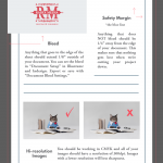
Always make sure that there’s ample space around text and images. Having them cramped at the border will feel…icky. (That’s a technical term.) People may not be able to say why looking at your piece has them feeling uncomfortable, but they’ll be less likely to ever look at it again. If these elements are too close to the edge, you also run the risk of having crucial information cut off when the piece is trimmed down from larger sheets. We generally recommend a ¼” (0.25”) text-safe margin for all items to compensate for any shifts in registration during printing and cutting. For particular pieces like a business card, this may seem like a lot, but take out a ruler and actually measure it. It’s a smaller difference than you think, and will give you a better end product that people will love to hold and to read!
3. Avoid borders when possible, and keep it spacious when not.
If you’re looking for a way to spruce up a simple design, you may think that adding a decorative border around your copy will bring a touch of elegance to it. You wouldn’t be totally wrong on that, but borders need to be done correctly, or you risk crowding your copy and making the design unappealing. Just like other elements in your design, you want them to stay within the 0.25” text-safe margin. If there are any shifts in registration, an uneven border will stick out like a sore thumb and potentially ruin an otherwise successful design. Additionally, make sure that you’re not trying to fit too much copy within the border—include only what is essential. You can always add a web address as a call to action to RSVP to an event or request more detailed information.
Another thing to consider is this: when working on a computer screen, people tend to think, This design is pretty good, but it would look especially nice if the copy were framed in some way. Again, they’re not wrong! But guess what? The piece will have a natural frame when it’s cut down to size. That’s right—the edges of a business card, postcard, invitation, and other items all provide a natural frame for your design. If you have any questions about how a particular design is working, paying for a printed proof will provide more answers than looking at it on the screen.
Then again, maybe we would all be better off if we just abolished borders entirely.
4. Use high resolution or vector artwork.
High resolution assets are critical for successful print design. Too often, people are in a rush to find an image for their project and they look for open source images on the Internet, or they pay for mediocre clip art, or hire a web designer to whip something up for them. This artwork is often 72dpi, but so what? It looks great on the screen, so that means it will print well, right? Wrong. Looking at 72dpi on a screen is much different than in real life, and the people you’re trying to hand your piece to will notice. So what’s the solution? Always use high resolution raster or vector artwork. We explain raster and vector artwork on our FAQ page, but here’s the skinny:
Raster images are made up of tiny pixels. The more of them that there are per inch, the smoother the image will look. For print production, the standard is 300dpi. The image should look beautiful at 100% but start to pixelate at 125% and larger. An image that is 72dpi, which was meant for the web, may start to degrade more quickly than that, and will almost always print badly. (There are exceptions to this, but burn that bridge until you really need it.)
Vector images are made from mathematical calculations. There are no pixels involved, just numbers. A vector image will look smooth and gorgeous at the size of a business card as it will on the side of a wall. If you wanted to slap your logo on the side of a space station, you’d want to use a vector image (just in case Elon Musk is reading this instead of…other things). Vector images tend to work best with solid colors and illustrations.
So before you rush to print your project, think first: is your artwork high resolution? Is the logo crisp? Would it be crisp if you wanted to put it on a postcard, a poster, a banner, or a….space station? If the answer to any of those (yes, ANY of those) is “no,” you’ll want to address that before you go to press. Your patience will pay off in the long run.
5. Consider the color of the paper.
Occasionally, someone will come to us with a design that is black text on a full-bleed colored background. It looks beautiful on the screen, but could be challenging to print, depending on the process you’re using. The conversation would be a little different for very large offset-printed runs, but if you’re looking for just a small print order to start off with and are looking towards either digital or letterpress printing, certain colors will be either difficult or even impossible to pull off.
But there’s another option available to you: printing black text on colored paper. Although it will be more difficult to see on the screen (since the background in your file would be white), it is almost always easier to print on a colored paper than to recreate a color. Not only that, but certain papers will also add a specific texture to the final printed piece that you could never approximate on a computer screen. French Paper is one mill that we use often, and they make incredible paper—it prints well, and comes in small quantities.
So rather than print in full color on white paper, start thinking of the paper itself as part of the palette, and let the inspiration wash over you!
6. Design for the printing process.
At Radix Media, we offer four print processes: offset, letterpress, foil stamping, and digital. None of these is “better” than the other, they each have their strengths. Knowing these strengths will help you design a better printed piece. There can be no worse feeling than putting your heart and soul into a specific design, only to realize that it cannot be reproduced the way you want. This not only hacks away at your morale, but the delay could cost you a lot of time and money. So it helps to think about the process first and design for that process.
For example, if you work at a company with a full color business card design that is reprinted often due to aggressive hiring or changing job titles, you will be better off printing digitally in small quantities.
If your design is simple and your goal is to present a a premium, high-end aesthetic, letterpress will serve you better.
Looking to produce a large run of something that will never change? (Let’s face it, you’ll have those 100,000 envelopes for a long time.) Go offset and call it a day.
Sometimes it’s not possible to put this level of thought into a piece before it’s done, especially when time is of the essence. We’ll always advise you on the best way to bring your printed piece to life, but it may require an open mind on your part. And if all this is too much for you, we also offer graphic design services so you can focus on what you do best.
7. Be versatile.
Let’s be honest, here: even if you keep the other six tips above in mind, things happen. Things change; a new boss comes along and throws your whole workflow into chaos or your designer says it’s time for a rebrand. Your needs at one point may not reflect those at another. So above all, you should be versatile. Consider all the things that could impact your design and all the ways in which it could be printed.
For example, you should avoid making your primary branding color a metallic. Why? As a general rule, metallic ink can only be printed either offset, letterpress or foil stamped (there are digital presses that claim they can do metallics, but we’ve not evaluated them and they are uncommon, so for our purposes…they don’t exist). This means that any time you need a quick digital print—an event flyer, a short run of business cards, a vinyl sticker in small quantities—you won’t be on-brand. So in this case, you’d want your primary brand color to be something recognizable, but reproducible in a variety of contexts. This will ensure that all of your printed assets will be consistent across different print runs regardless of the particular process or machine. This is also helpful when you need non-paper items printed, such as textiles.
There are many different ways to to print a variety of business assets and stationery, and the details matter. It you follow our tips for designing great printed materials, we guarantee that they will look great.
But here’s a bonus tip: don’t wait until the last minute! Contact us about your next project as soon as you can and we will happily advise you to make it painless and successful. You can also browse our portfolio for examples of successful print design in a variety of products ranging from business cards to posters, wedding stationery to booklets.
We want you and your project to look great, so we hope that these tips help you design a better printed piece. The world thrives on good communication, and that communication often begins with an amazing piece of printed material.
